The fashion for posters has been going on for a few years now. Whether you prefer the thick black frame or the DIY tags, they always look good. What is the guiding principle when choosing posters? What kind of posters you should choose for your living room – today we will tell you.
Living room posters – what to choose?
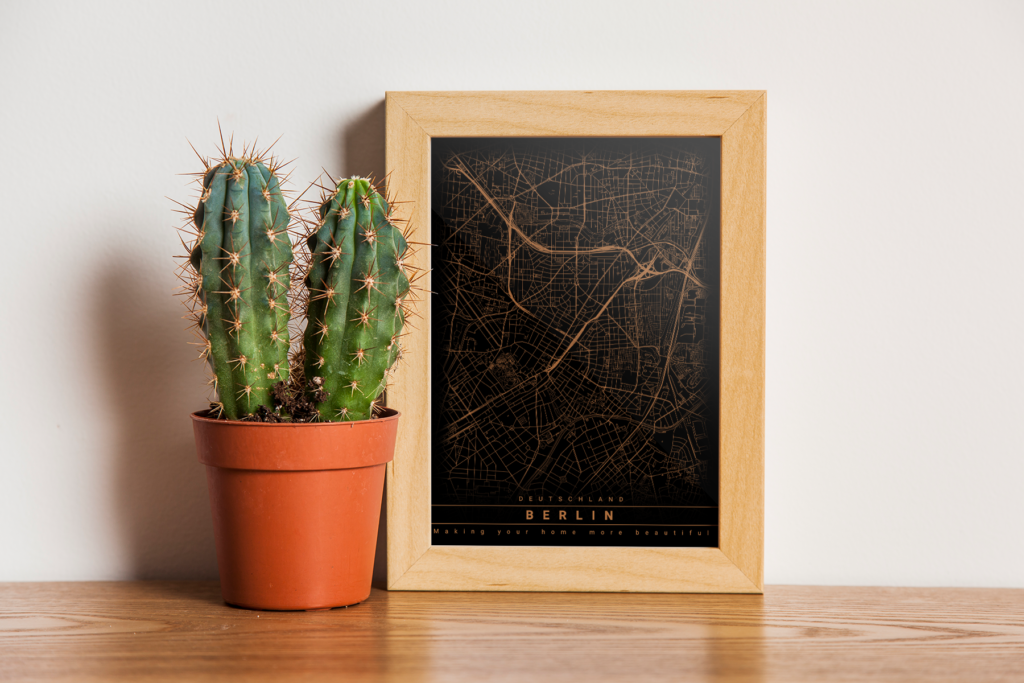
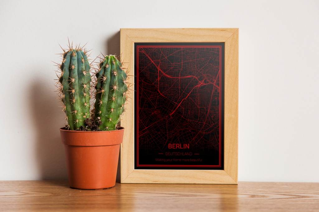
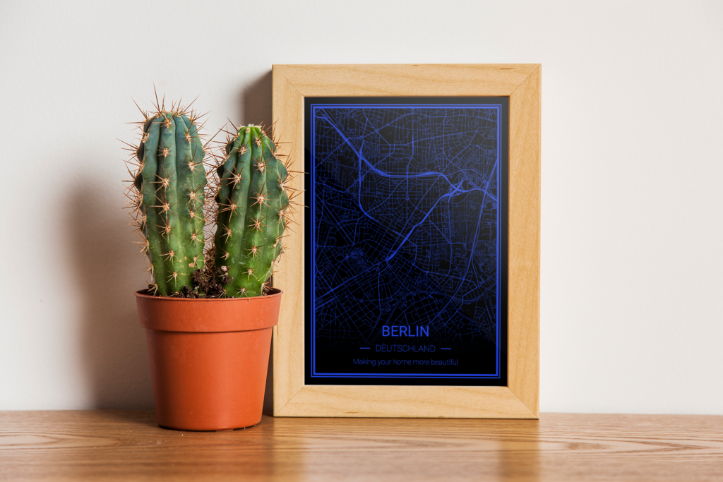
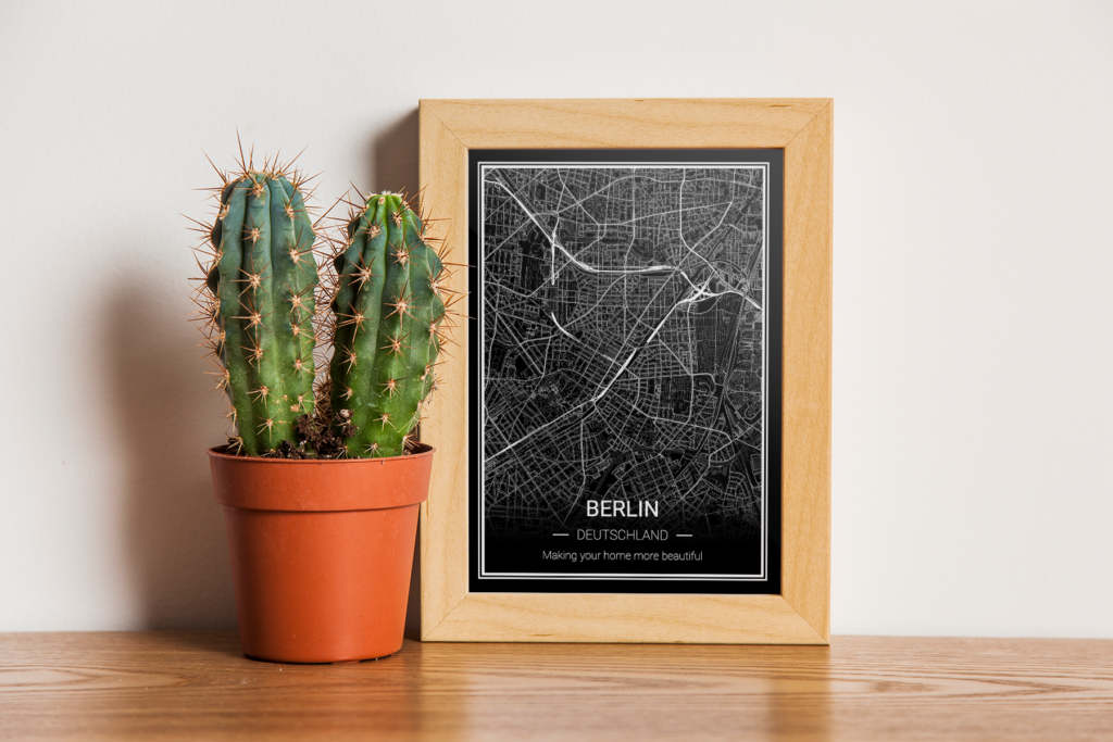
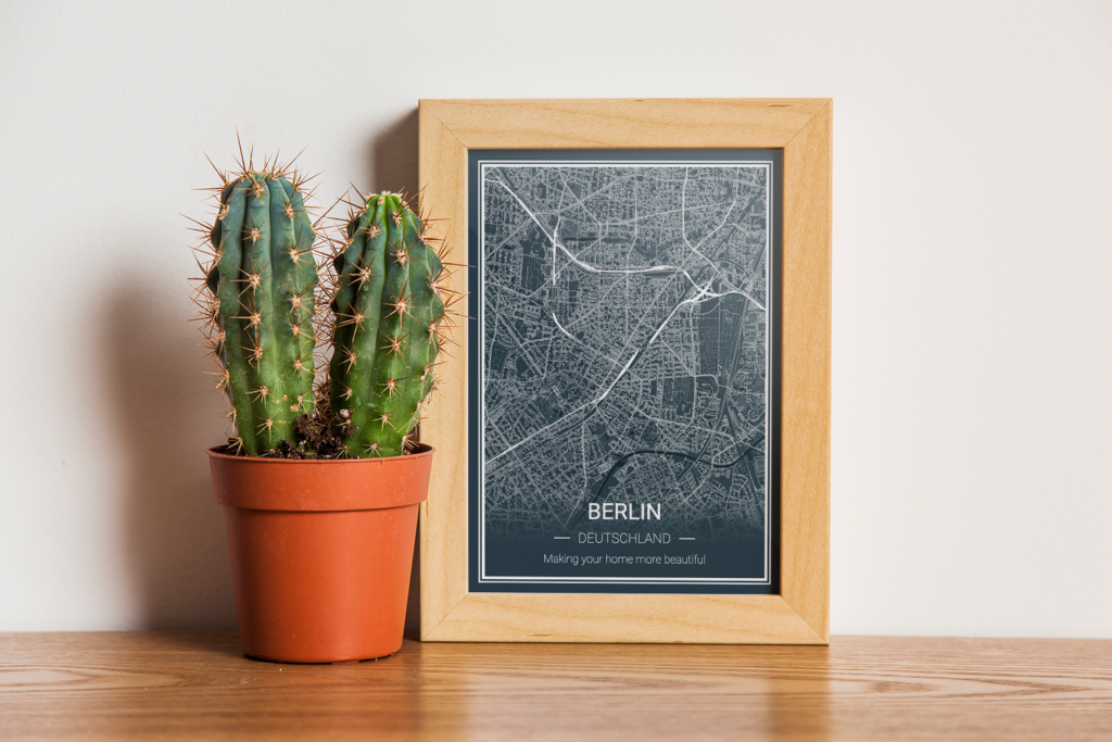
In Mapeo.ch you have the choice between different map styles – once you have chosen your favourite city, you can move on to choosing the colours and style in the next step. What are the differences? The styles prepared in the poster configurator differ not only in colours but also in font and text layout. The differences are minor – but as we know well, the quality is in the detail! And it is precisely this detail that can emphasise the ambience of our living room.
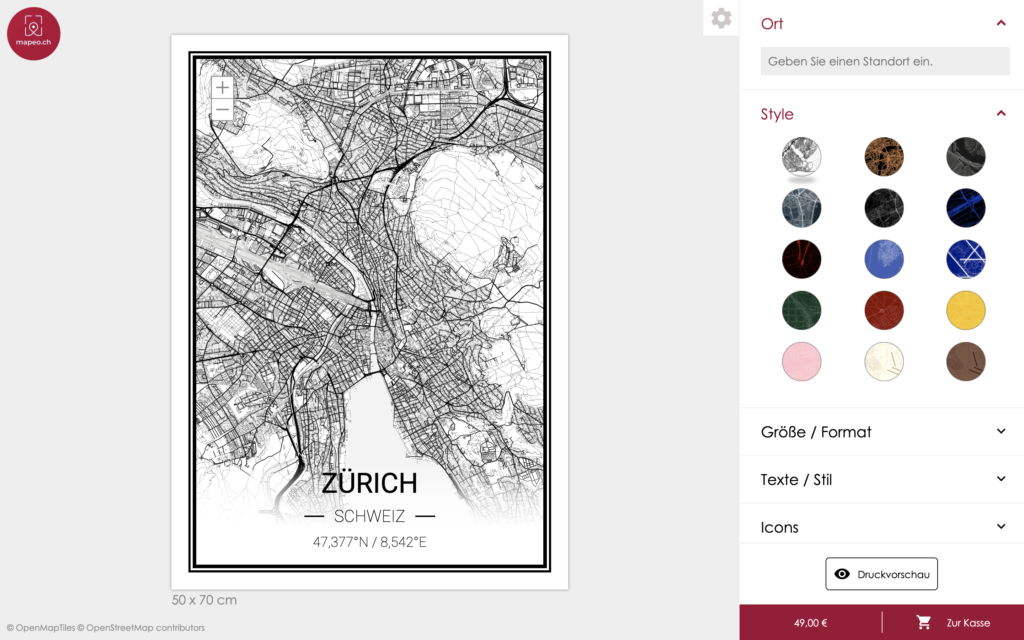
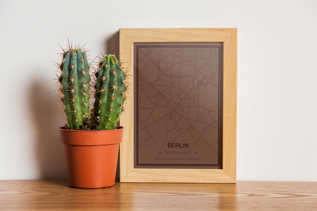
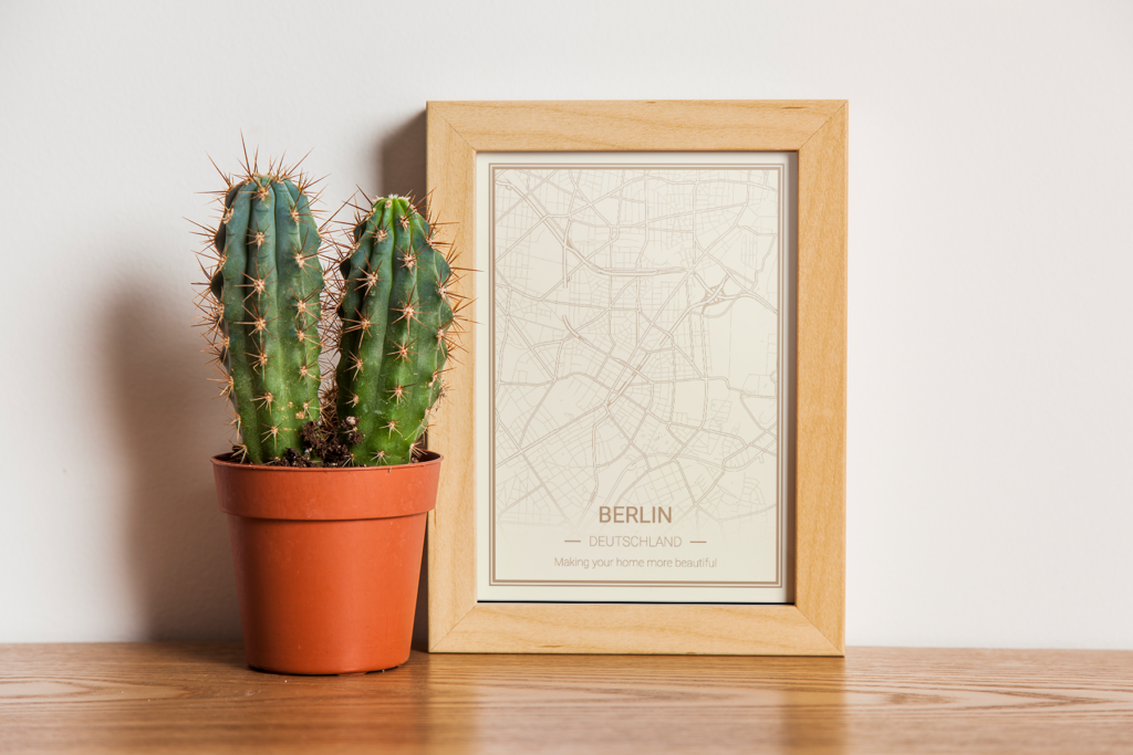
The map posters ordered on mapeo.ch are in premium quality – a treat for all those who care about beautiful colour prints that do not fade. The maps feature high accuracy and sharpness of contours, making premium quality posters an ideal choice for intricate colour graphics. We recommend them to anyone who wants high quality and perfect colour reproduction.
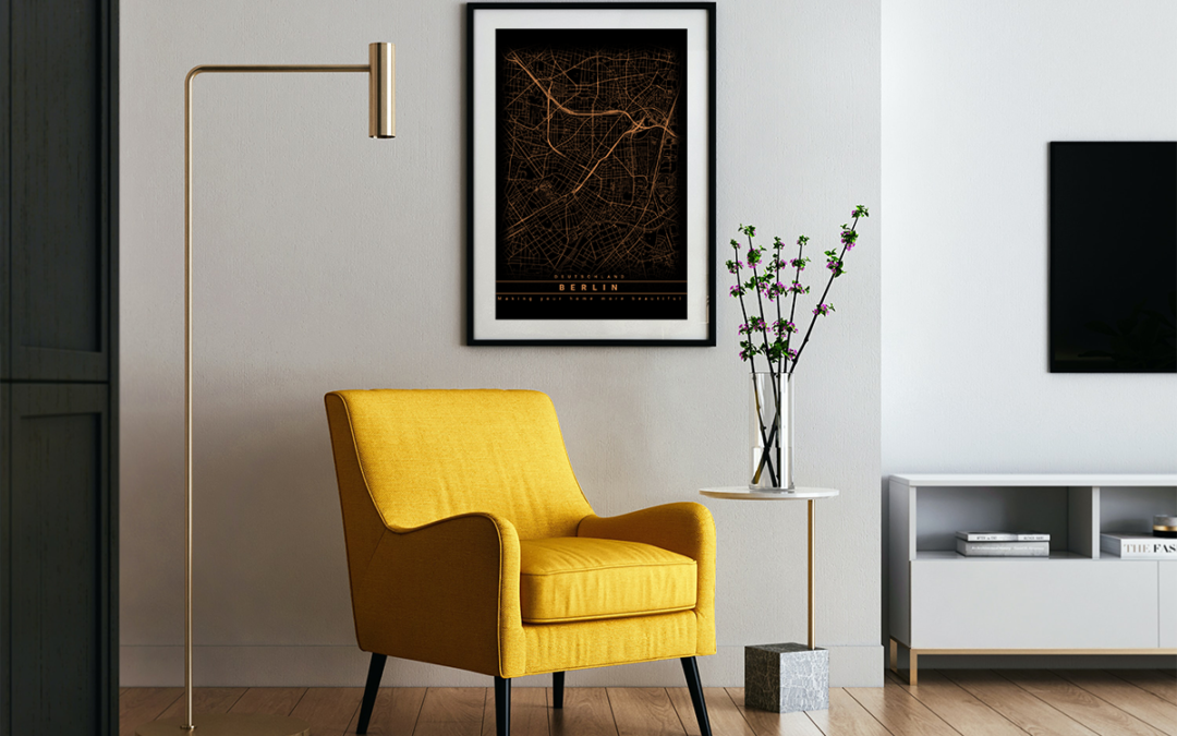
Posters that match the interior.
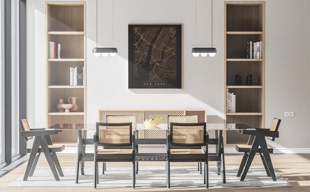
While choosing your favourite city will probably be the easiest, choosing the right poster style is no longer an easy task. Especially when we have to answer the question of which colour poster is best for your living room or kitchen. We have prepared several styles for you to choose from, which will perfectly emphasise the individual character of your room.
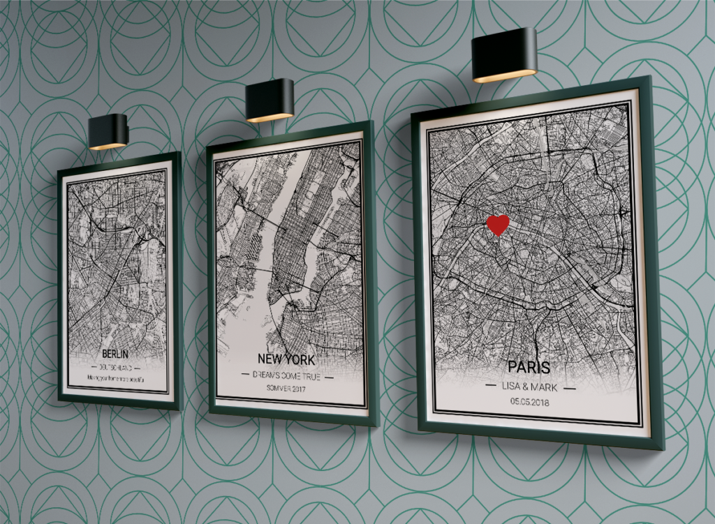
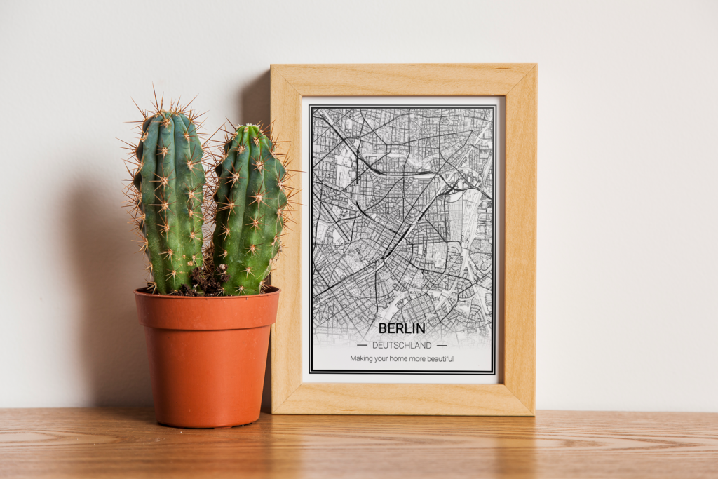
Before you add it to your shopping cart, set the location and colour scheme of the poster. It is good that the colours match the style of the room. Black and white cards are a safe choice – they go with everything. If you have trouble deciding on a décor, check your poster for colours that already appear in the room. This way, the harmony is maintained.
Are you thinking about the choice of frames? The principle is simple – the more modern the interior, the softer the frame. Solid frames work well in classic interiors. In Scandinavian and industrial interiors opt for thinner frames or anti-frames. In glamour interiors, you can really go for baroque-style frames.
Neueste Kommentare